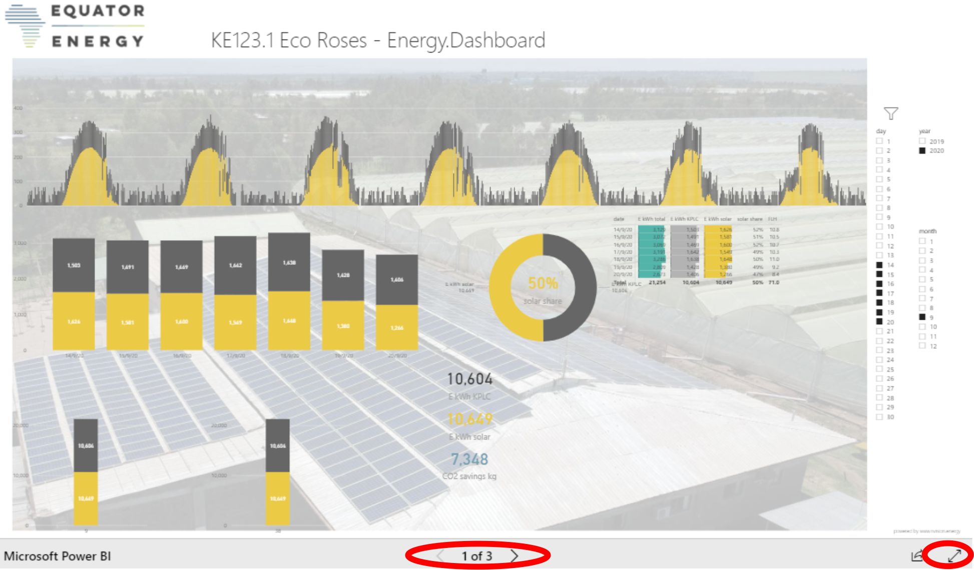
The dashboard has three pages, which you can switch between using the arrows at the bottom centre. You can also expand the dashboard to full screen using the arrow symbol at the bottom right
The dashboard has three pages, which you can switch between using the arrows at the bottom centre. You can also expand the dashboard to full screen using the arrow symbol at the bottom right
First: the page is interactive. With the selection menus circled in yellow on the side you can select for which year, month and days you want to see the data. You can select multiple options by pressing Crtl while selecting boxes.
A – D are stacked bar charts of your energy supply in kWh split between solar (yellow) and KPLC. The data is the raw 10 minute data (A) and aggregated data by day (B), week (C) and month (D).
E is a table with data per day (it will fill up over time now) with the kWh supply figures from KPLC and solar again, the relative share of solar supply and the relative performance of the solar power plant. That relative performance is measured in full load hours (FLH), which is simply the relative energy supply per kW of installed AC capacity, so it’s the total solar kWh for the day divided by the 150 kW AC capacity.
F is a pie chart of the solar supply fix for the entire selected period along with the relative solar share for that period.
G is total supplied kWh for the entire selected period again along with the approximate CO2 emissions avoided by the solar energy. Might be good for your CSR report.
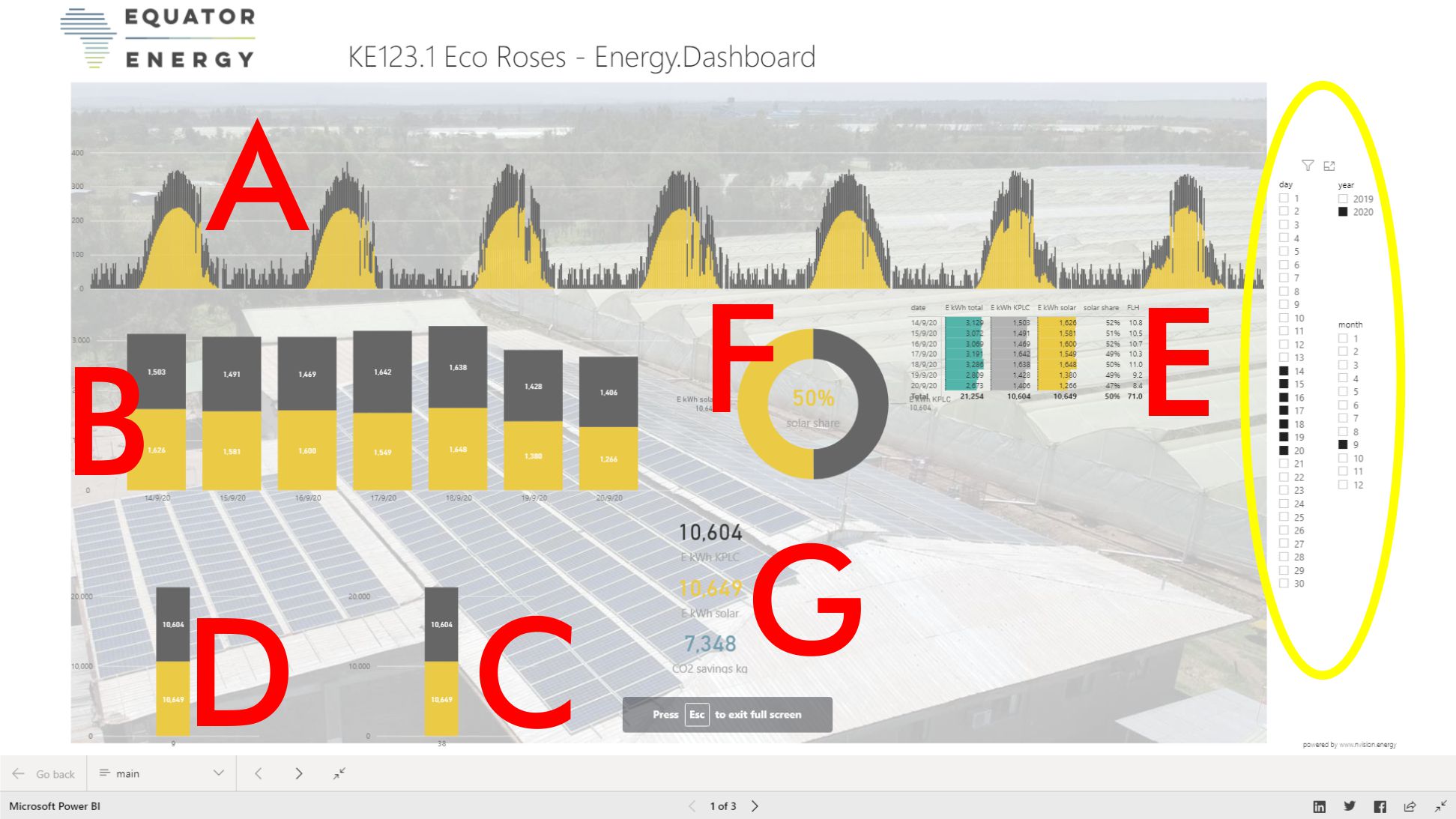
Page 2
This page is not interactive and always shows the following:
A: the last data that was processed. Background: the smart meters and data logger upload data to our server every hour on the hour. The online dashboard system processes this data every two hours starting from 06:30 until 20:30 every day.
B: the 10 minute interval raw data for the power supply from KPLC and solar. This is always shown for the last 48 hours.
C: this only applies to multiple inverter projects where we compare the relative performance of individual inverters
D: is the same daily table as on the first page, but this always just shows the last 14 days.
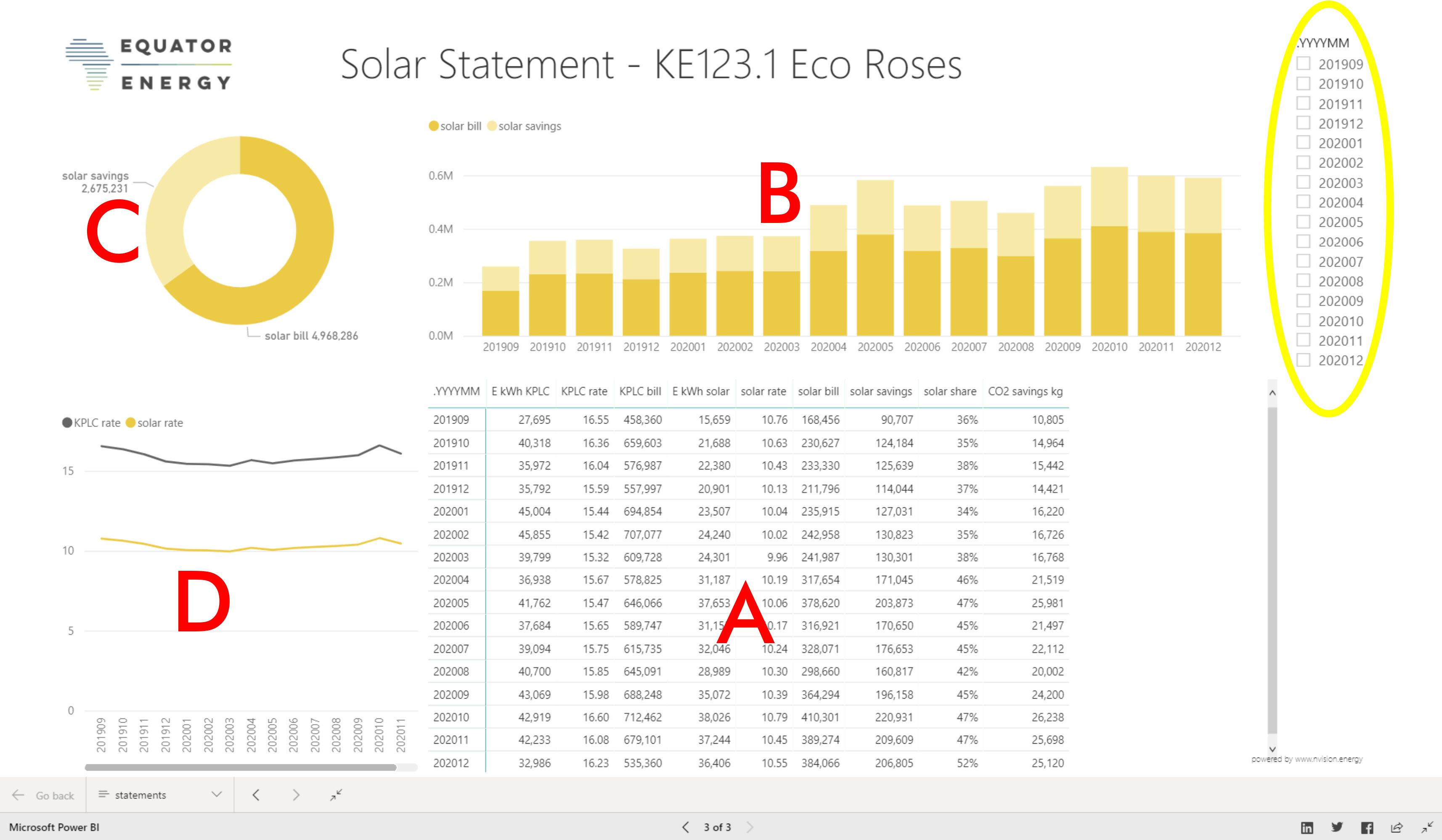
The third page is about the financial performance of the project. This page will only populate with data after the end of each month. So you will see the first data here from early January. We will email you about this.
This page is interactive again. On the side you can select the month(s) you want to view.
A: a month by month table of the energy you got from KPLC and from solar along with the rates, the total amounts, the savings and also the relative solar share and the CO2 savings again. This is what our monthly bills are based on.
B: is a stacked column chart that summarizes the solar cost and savings by month.
C: is a pie chart of solar savings and costs for the entire selected period
D: is a graph of the solar and KPLC rates. Once there’s more than one month, this will turn from dots into lines.
Built with Mobirise web page theme
FOLLOW US